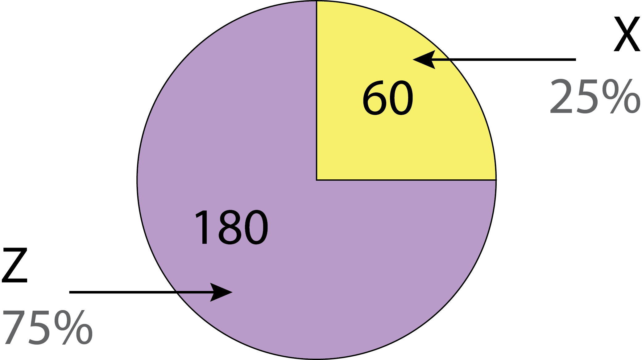
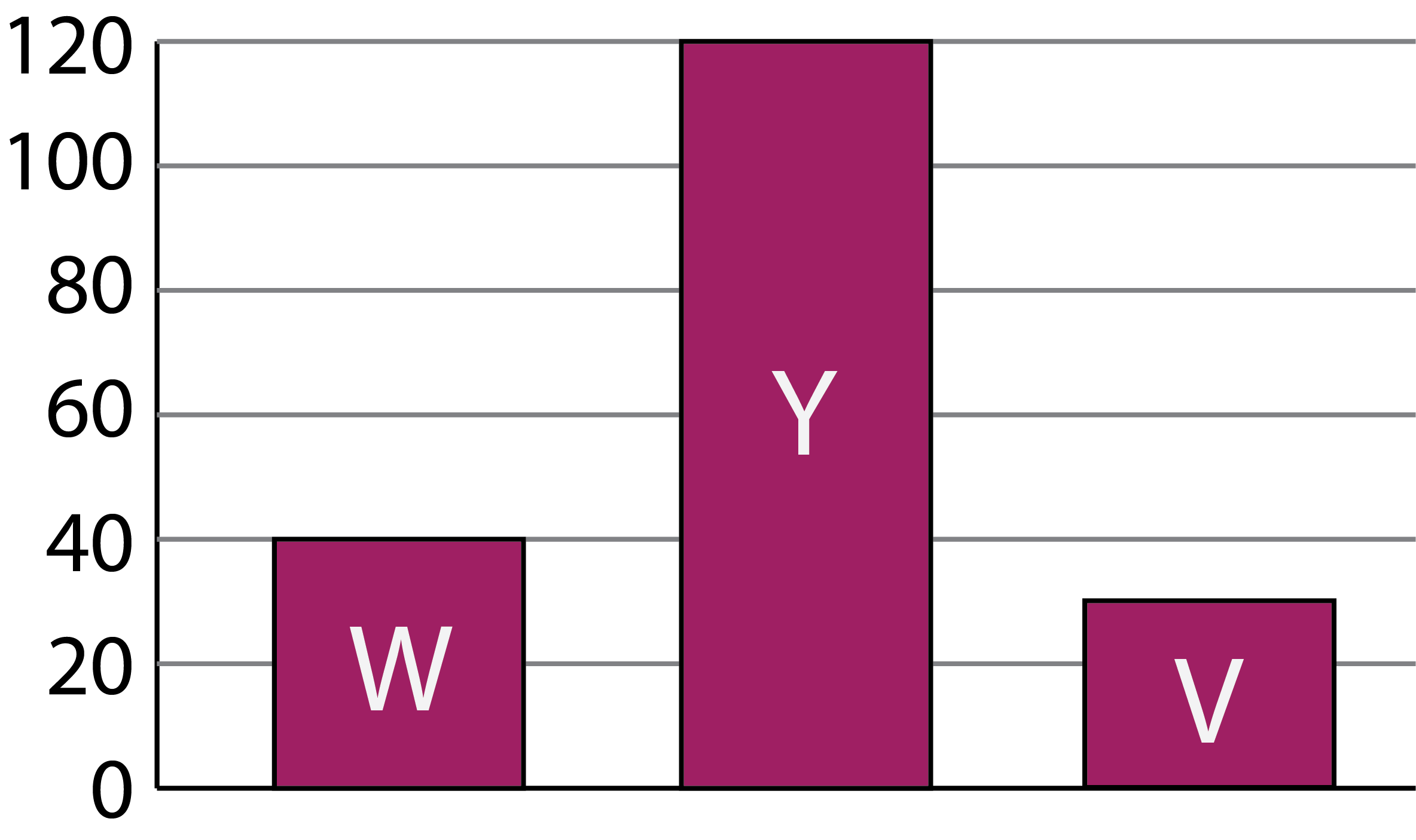
Jasmine created a circle chart and a bar chart based on data values, but forgot what numbers went with which chart. The charts are shown below. There are five values in total, two belong to the circle chart and three belong to the bar chart.
Here are the values: V: \(30\), W: \(40\), X: \(60\), Y: \(120\), Z: \(180\)
Label each chart with the letters matching the appropriate values. Then add values to the scale on the vertical axis of the bar chart.
Comparing the size of the sections in the circle chart, we see that the smaller section appears to be one quarter of the whole circle and the larger section appears to be three quarters of the whole circle. This means the larger section is three times the size of the smaller section. Comparing the heights of the bars, we can see that the tallest bar is three times the height of the leftmost bar. We should look at the data to find pairs of numbers where one number is three times the other number.
From the values listed we see that \(3 \times 40 = 120\) and \(3 \times 60 = 180\). So the circle chart values could be either \(120\) and \(40\) or \(180\) and \(60\).
If the circle chart values are \(120\) and \(40\), then the remaining three values would be the bar chart values. This would mean that the tallest bar would be representing the value \(180\) and the leftmost bar would be representing the value \(60\). This means the rightmost bar would be representing the remaining value, which is \(30\). However, \(30\) is half as much as \(60\). This means the rightmost bar should be half the height of the leftmost bar. In the chart, we can see that the rightmost bar is more than half the height of the leftmost bar. Therefore, these values cannot be correct.
If the circle chart values are \(180\) and \(60\), then the remaining three values would be the bar chart values. This would mean that the tallest bar would be representing the value \(120\) and the leftmost bar would be representing the value \(40\). This means the rightmost bar would be representing the remaining value, which is \(30\). Since the rightmost bar is more than half the height of the leftmost bar, the values of \(40\) and \(30\) would be reasonable.
Based on this logic, the leftmost bar represents the value \(40\). The top of the bar matches the second grid line. Since the grid lines are equally spaced, we can conclude that the distance between grid lines is \(40 \div 2 = 20\).
Here is the labelled bar chart:
Here is the labelled circle chart: